Some infographics
In 11 years of working with journalistic infographics, the last two as an editor, I made literally thousands of infographics on the most diverse subjects. Although seen by most coworkers as data embellishing , my infographics department was primarily concerned with the "usability" of the infographics we produced. They needed to tell a story, evidence data, explain, denounce. This selection of examples did not focus on the most spectacular ones, but on those that, within the triviality, stand out for their production and the resources used and presented.
State Representatives' expenses
The infographics department also participated in what was still beginning to be known as data journalism. Within the idea of "small multiples" - small graphs that, presented together, show data more efficiently -, I chose to show the different patterns of spending of reimbursement funds: there were deputies who left to spend everything in November and December, and deputies who spent regularly throughout the year. The total graph is the input to the data, which unfolds into two interpretations.

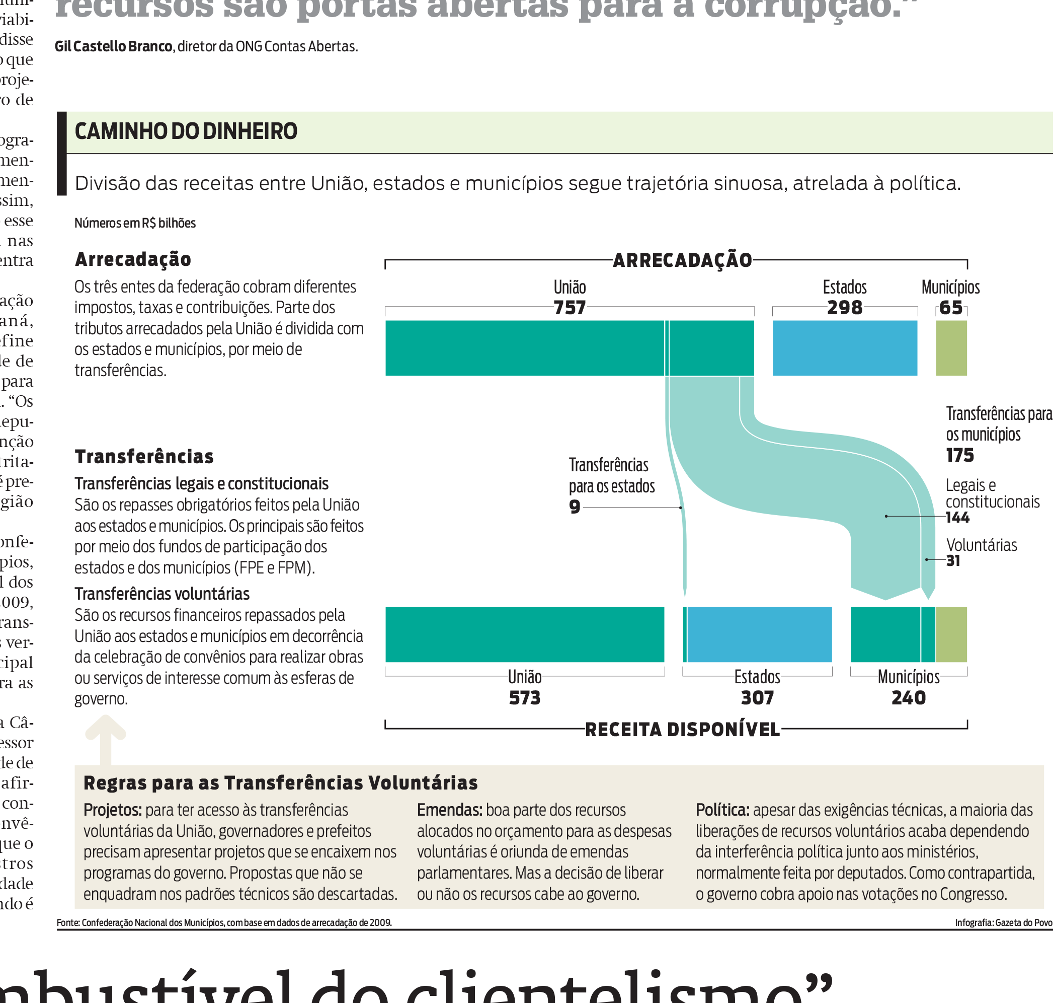
Fund transfers to municipalities
Despite being done quickly, this infographic was praised for its simplicity and efficiency. Years later, I find out that the name of this type of graph is Sankey diagram.
Service Time Guarantee Fund's profits
A step-by-step explanation that included a "deviation" to display fund amounts. I gave up the color cyan, because I always wanted to work on a project to be printed in two or three colors.

Alcoholism
Explanation of the effects of alcohol on the body. I love the 1950s illustration style.

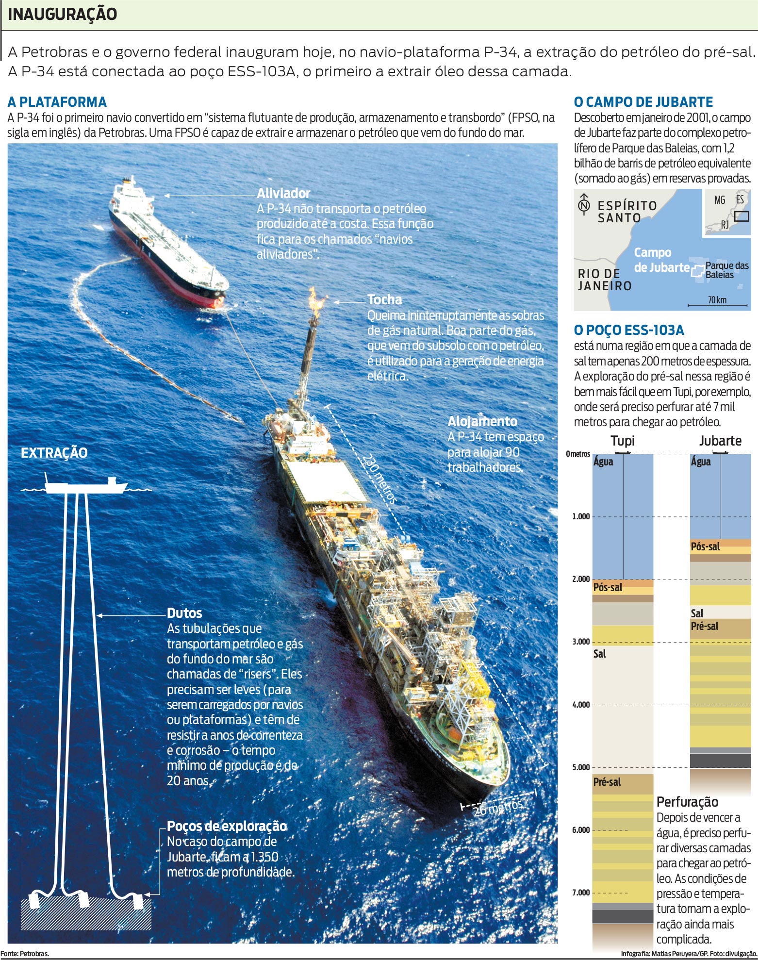
Oil extraction
Sometimes a good photo, with big areas to layout some text, solves half the problem . The other half was solved with schematics and a small map.