Books (made)
Making the graphic design of a book was a task that eluded me. Finally, interesting projects appeared – including teaching on the subject. In these works I took the opportunity to work on typography in a refined way, and also to create completely accessible electronic versions, without losing any content. There were no tables turned into jpgs, for example.
Abóboras ao Vento
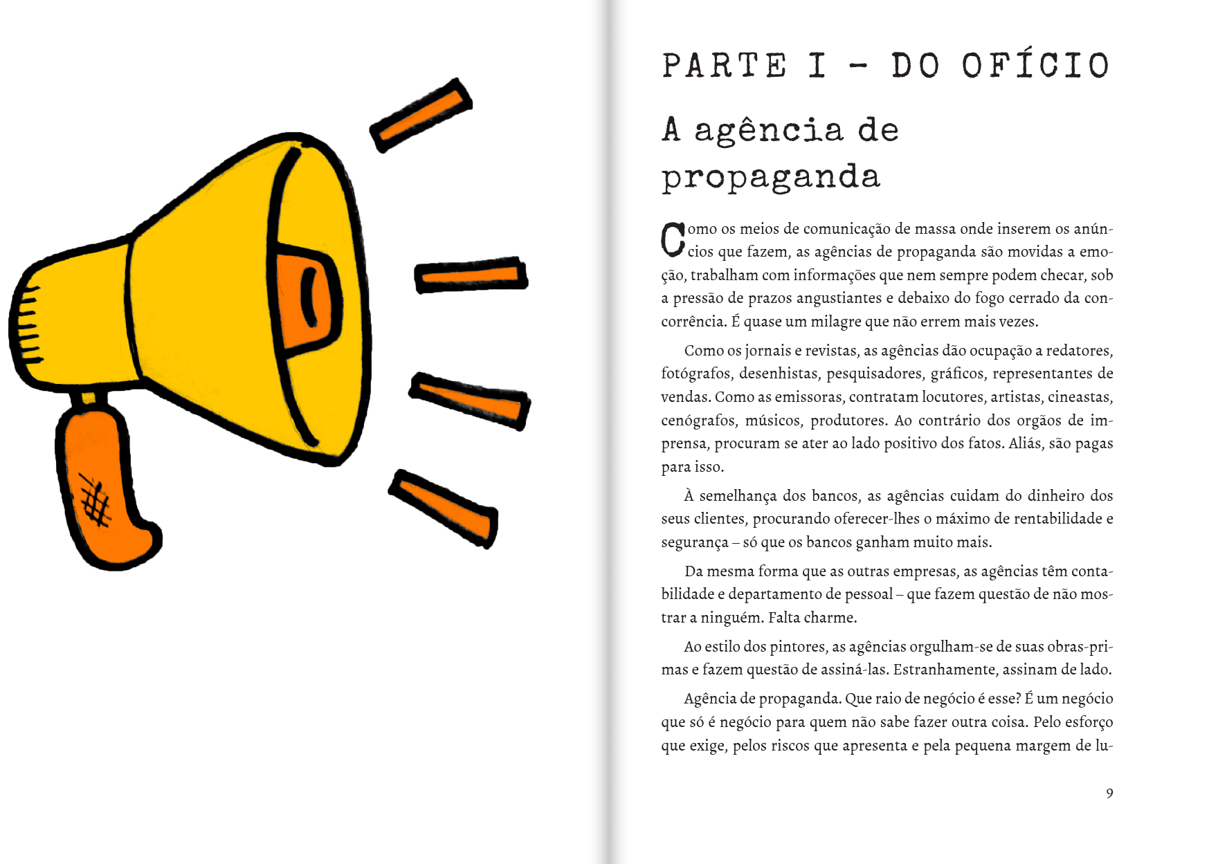
After No blog do Dodô, me and Evandro Barreto had the idea of working together on the reprint of his book Pumpkins in the wind: everything we knew about advertising but are forgetting. Once the contract with the previous editor ended, it was possible to relaunch the book. It was released to be printed on demand, and also in electronic format. I made the cover, the illustrations, and the pages. Evandro's trajectory as a writer appears on the typewriter on the cover and also in the book's titles.

Chronicles in the Classroom
Professor Eugênio Vinci de Moraes – former teacher that now is my colleague – wanted to do something special with the chronicles produced by the students of the journalism course. I came up with the idea of producing a book to be printed on demand, so as not to incur high printing costs.

Each section has an opening with illustrations by Wilson Elias Junior, illustrator and then advertising student.
For the textblock, I chose the Jenson typeface, which has very peculiar characteristics. The title and authors' names were valued not so much for the size of the letters, but for the white that frames them. The cover has a retro feel, thanks in part to the Paralucent typeface.
Testimonies
The book, a tribute to an important woman in her community, presents several testimonies about her. It was my finest typographic work yet, with pages of well-composed text with almost no hyphens.