Network analysis graphs - bibliographies and relationships in social networks
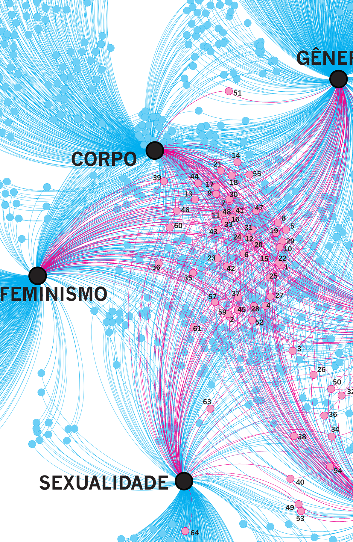
One of the hypotheses of Dr. Máira Nunes' PhD Thesis was that Brazilian theses and dissertations on gender and sexuality rely too much on bibliographies from other areas. To confirm this hypothesis, I worked by analyzing the corpus of approximately 200 theses and dissertations on the subject. This involved several steps:
- Separation of bibliographies from theses: I used Python scripts and the pypdf library to separate pages from bibliographies.
- Verification: manual checking of the text files obtained.
- Tabulation: separation of data into columns, using Regex, Open Refine, Excel and Open Office. It was a very laborious step, due to the different interpretations of the ABNT standards of each researcher.
- Plotting: Explore the different visualizations in GePhi.
- Finishing: preparation for printing, with colors using pure inks, in Adobe Illustrator.
An interactive version was also made, for use by the researcher.

As a good high-density visualization, the final result can be read at several levels, both macro, more general, and micro, observing details and other relationships.
Contact Network
Another graph was also made, mapping the groups of friends on Facebook of the subjects of the study. As Facebook had blocked access to scraping tools, the researcher was asked to open the friends lists on Facebook itself and copy and paste everything into a Word document (since it was easier for her), which was then processed with text editors (TextWrangler) and spreadsheets (Excel) to get the data in the proper format for GePhi.

Another infographics
The thesis also had several other data that benefited from the resources of infographics.
